VANTAGE
Board game by Jamey Stegmaier, Stonemaier Games (2025)
How to create 600+ illustrations – Staying motivated, working economically, and crafting one cohesive world over several years
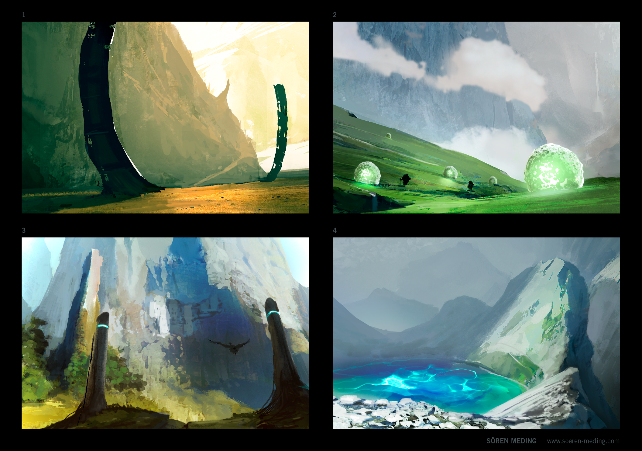
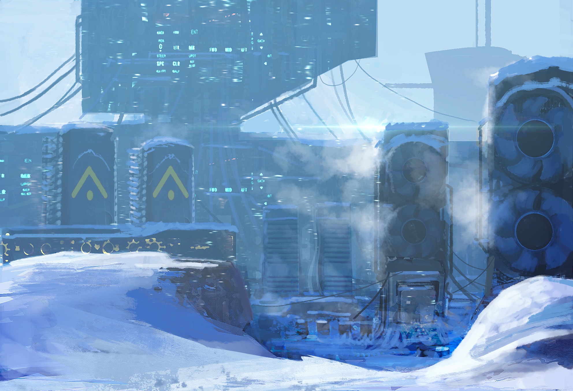
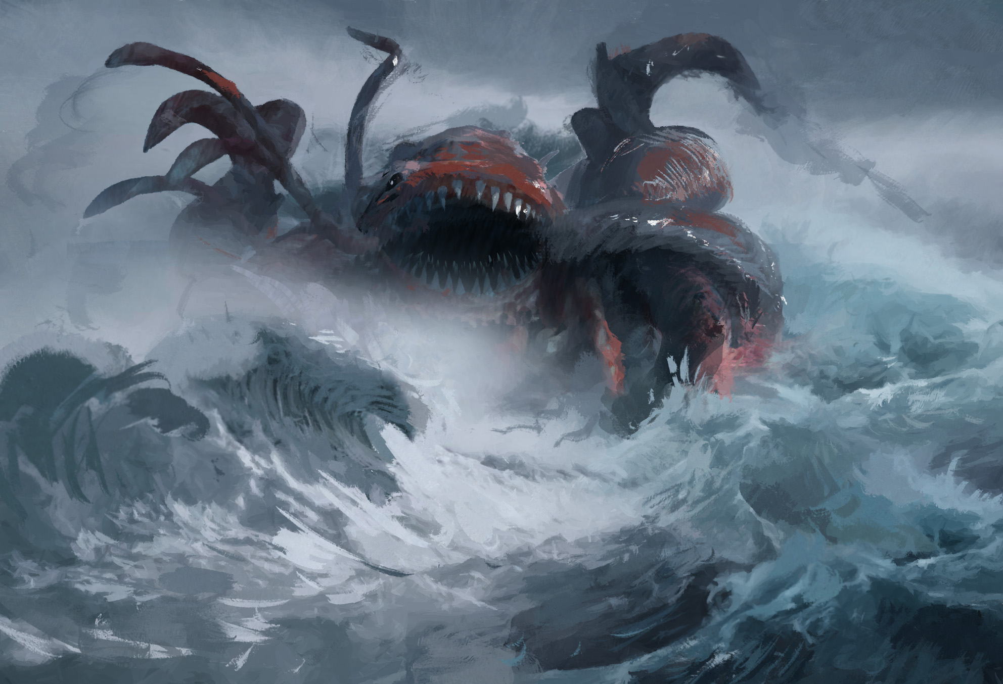
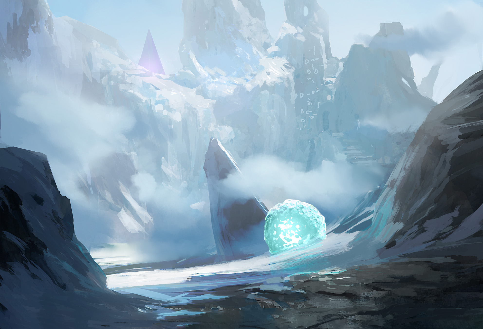
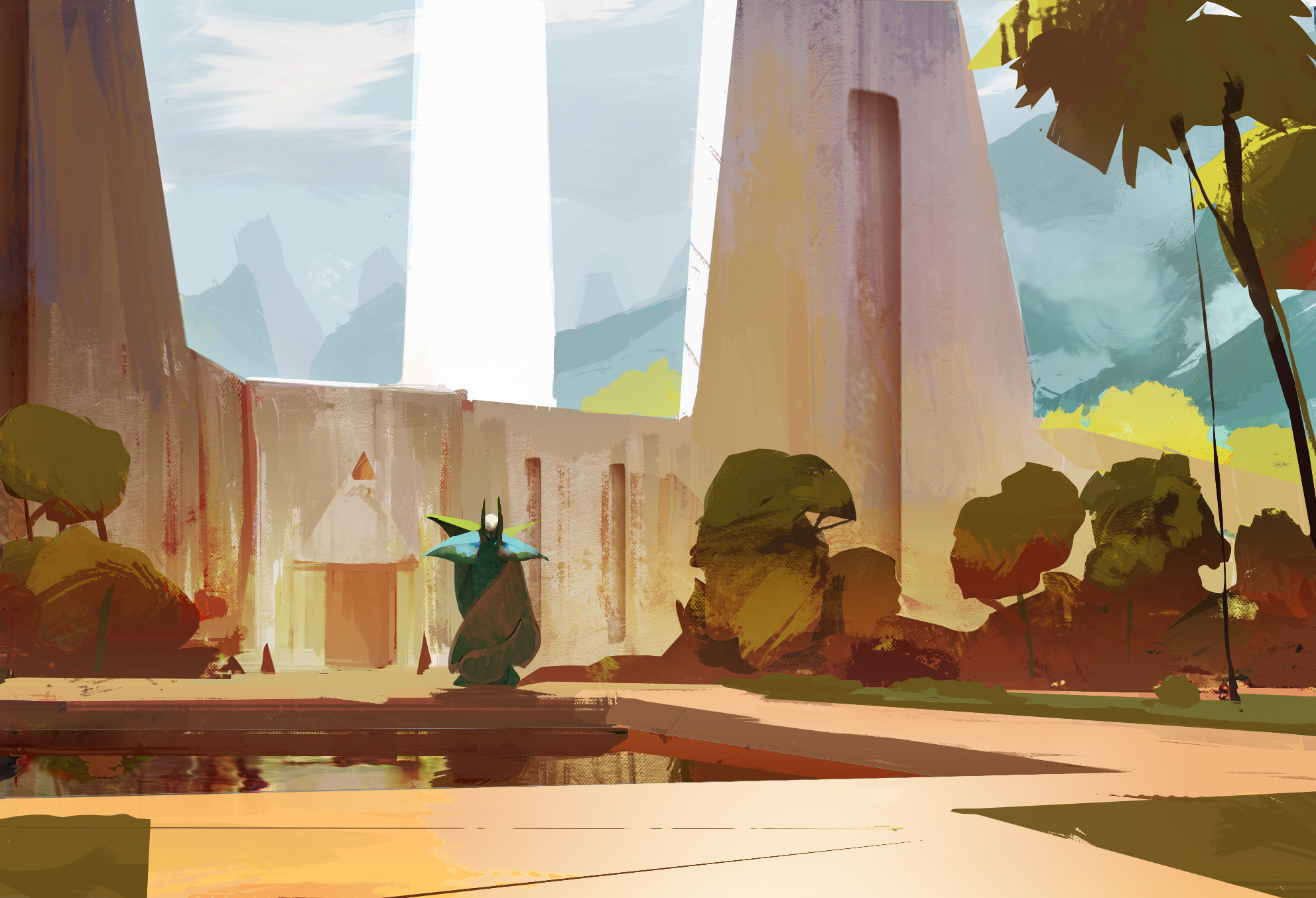
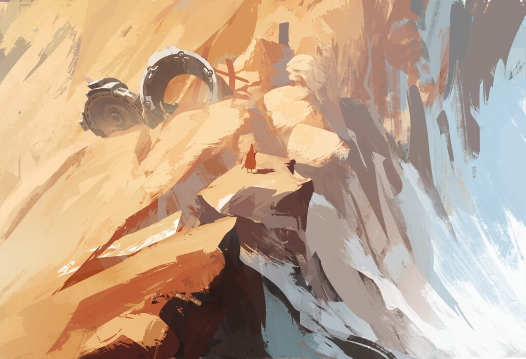
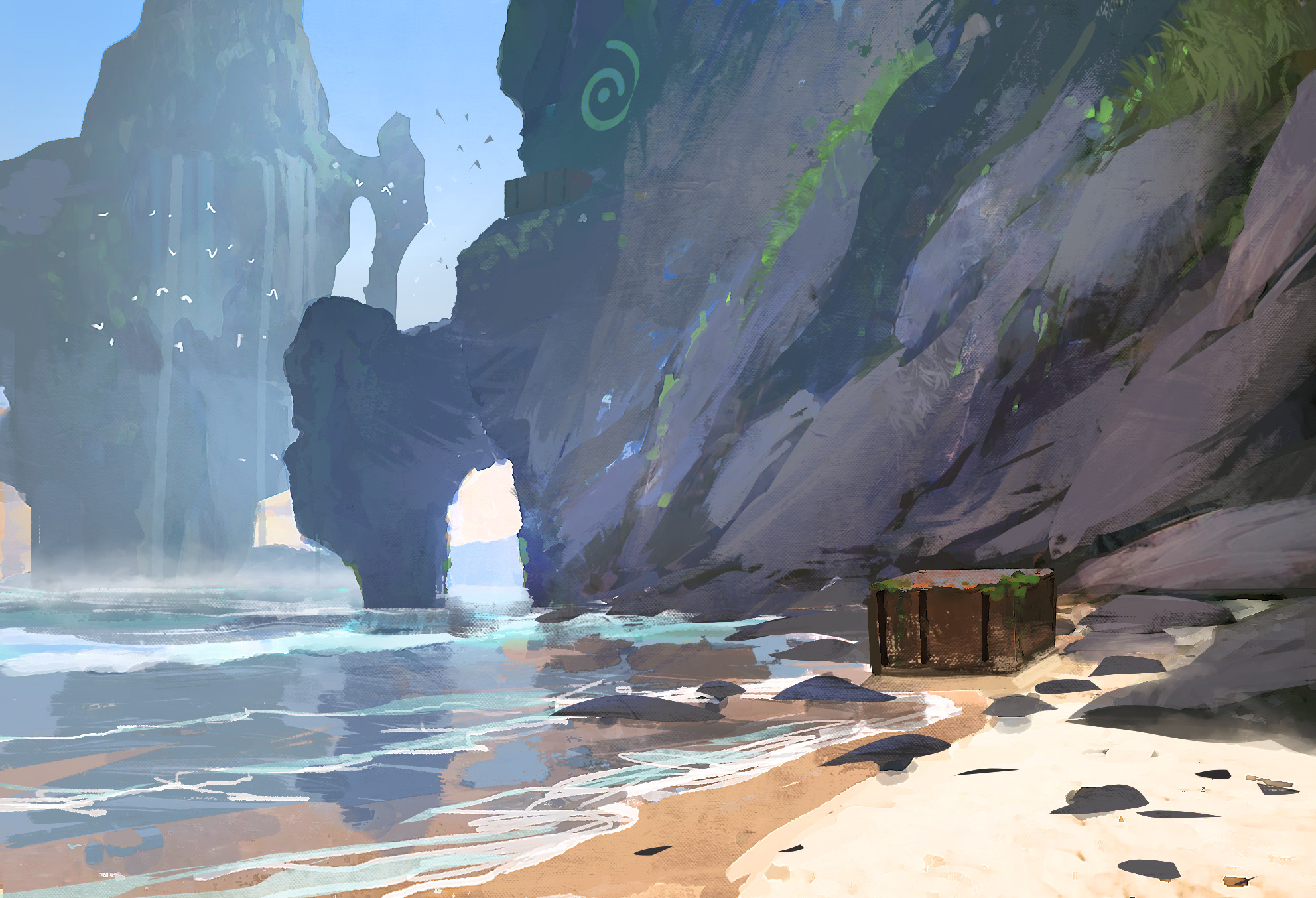
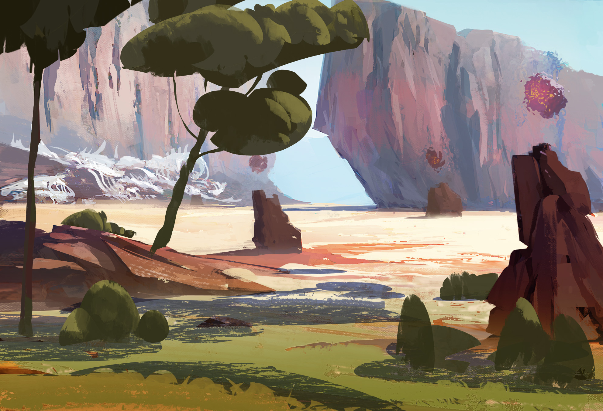
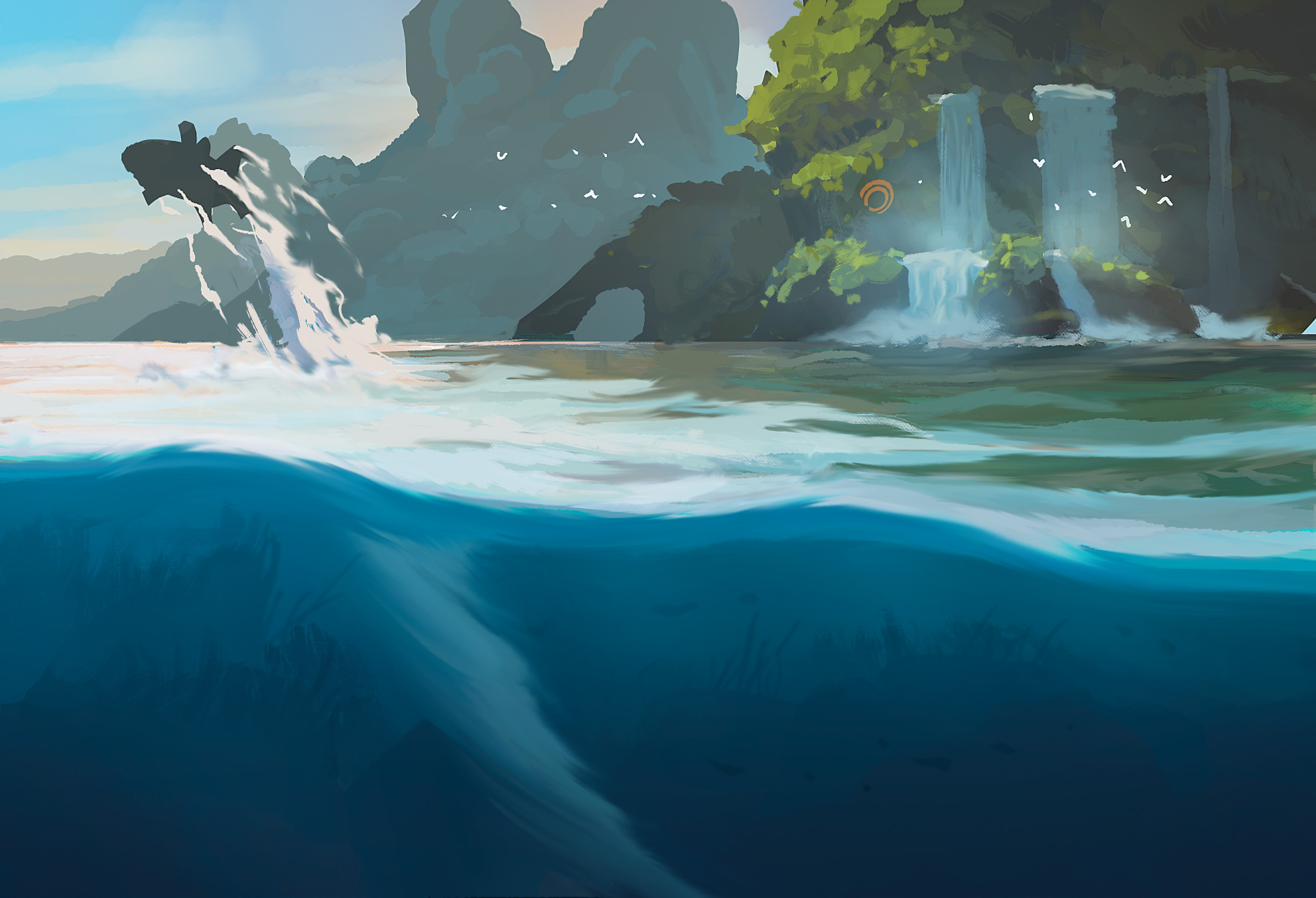
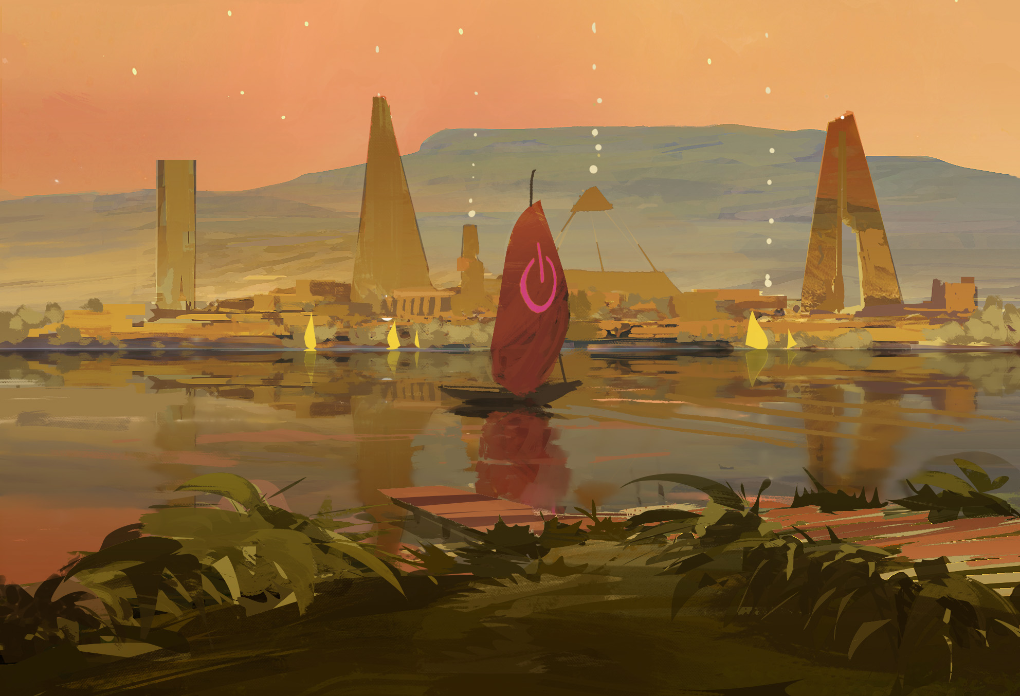
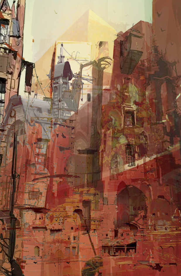
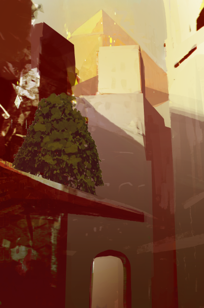
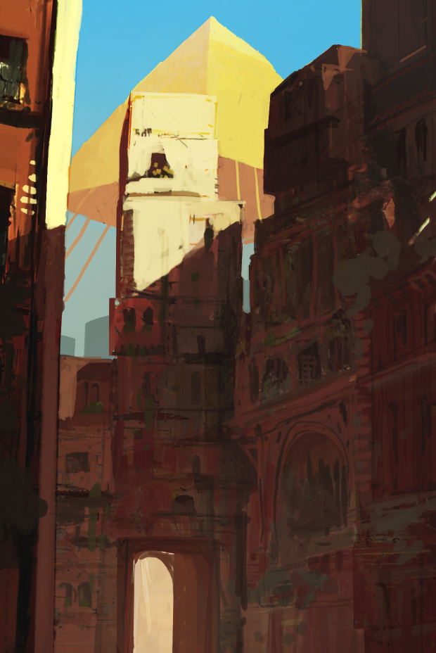
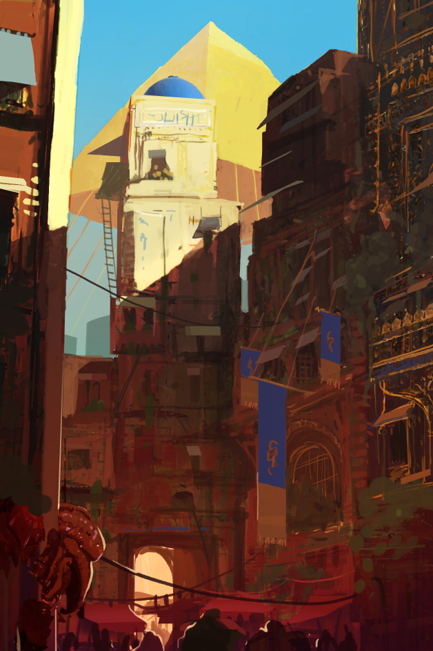
In 2017, Jamey asked me to collaborate on his new project. The four images to the left were the initial art test. Back then, I didn’t know much about him, only that he was somewhat of a legend, and that his games were incredibly successful. So, no pressure!
After several years of working together, I can honestly say I’m incredibly lucky and grateful to have met one of the kindest people I’ve ever worked with. Jamey is friendly, incredibly responsive, gives you a lot of artistic freedom and even made sure the artist’s name appears on the box.
Seeing the final product after so many years is just very exciting. Working with someone like that is already half the battle when it comes to staying motivated during so many years.
Once the collaboration began, I knew the budget per card and how much time I could realistically spend on each illustration: about two hours. All the illustrations were meant to form a cohesive world, so careful planning and preparation became absolutely essential.
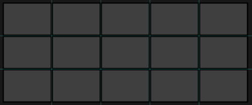
To create a cohesive world, it’s definitely not ideal to illustrate just one card at a time. A large grid layout really helps to keep track of everything. However, the bigger the grid, the harder it becomes to manage: performance drops, the overview gets lost, and it’s harder to feel that sense of progress and artistic satisfaction from “finishing” a section. Working on different themes and areas was incredibly helpful for staying motivated. Were there moments of low motivation over the years? Of course! But more often than not, the motivation came back once a batch was completed. Finishing a batch always gave me a strong boost, it felt rewarding and kept me going.
We quickly discovered that working in batches of 20–30 illustrations was the sweet spot, manageable, structured, and motivating.
These batches got names like 25 Green Rocks or 20 MetalSnow and were connected to each other using special transition locations. More on that below.
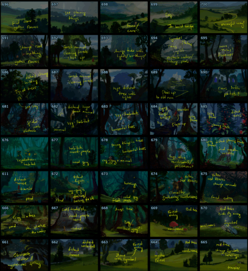
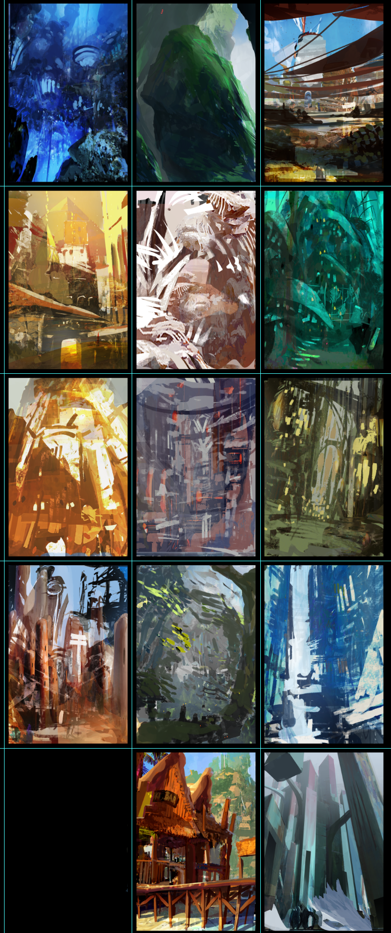
This forest batch was a bit larger than usual. You can see some of my notes here. Small details to give each card its own unique touch. Both Jamey and I contributed ideas for the themes. I usually had a lot of creative freedom to come up with concepts, and later, Jamey would refine them to make sure everything fit the game world and mechanics.
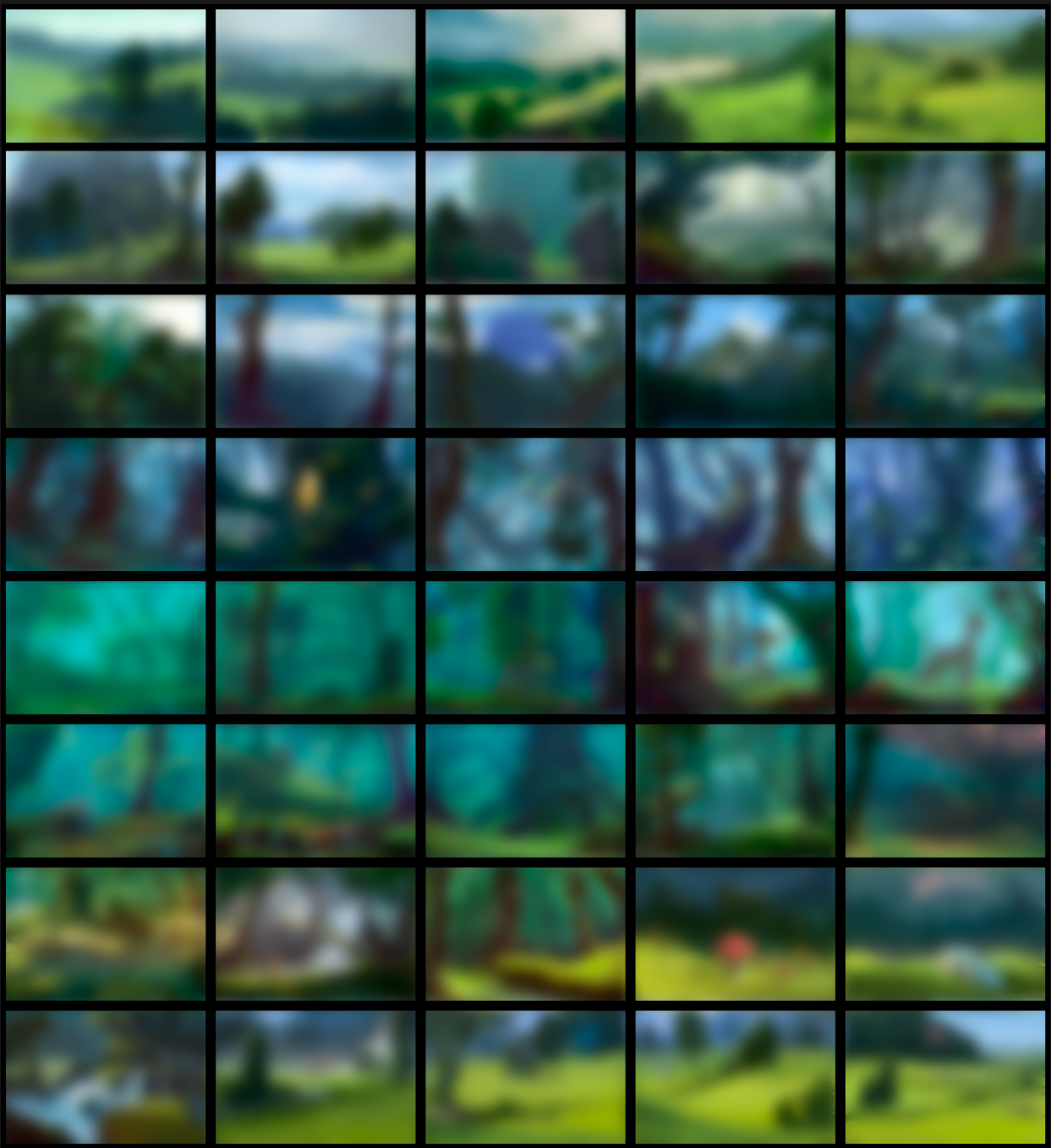
I don’t want to spoil anybody, so I’ve blurred the final cards in this image. This batch of 40 locations took about one to two weeks to complete. Since I always made sure to stick to the planned time budget, I never had the feeling of doing “unpaid” revisions. Feedback and corrections were always handled quickly and efficiently. And whenever there was extra work beyond the original scope, Jamey was always generous in compensating me.

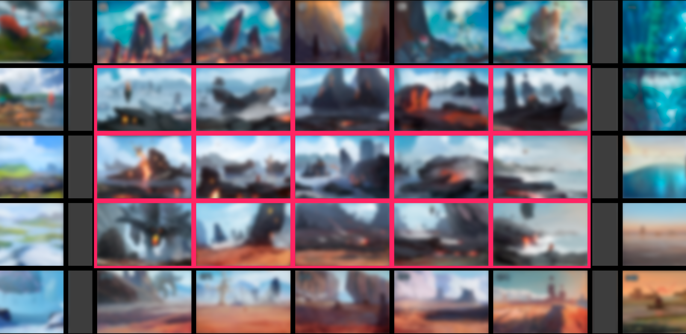
To connect and blend all the different batches together, we needed transition cards, for example, where an ice world meets a desert world. But what does a transition location like that actually look like?
The effort required for all these vertical and horizontal transitions was definitely not to be underestimated. Since the environments were often vastly different, it was a real challenge to create logical and visually convincing connections.
In the images, you can see how I used special grids for this purpose. I placed the “old” batches to the left, right, above, and below the new section as reference points. The red frames mark the transition locations that had to bridge the gaps between those worlds.

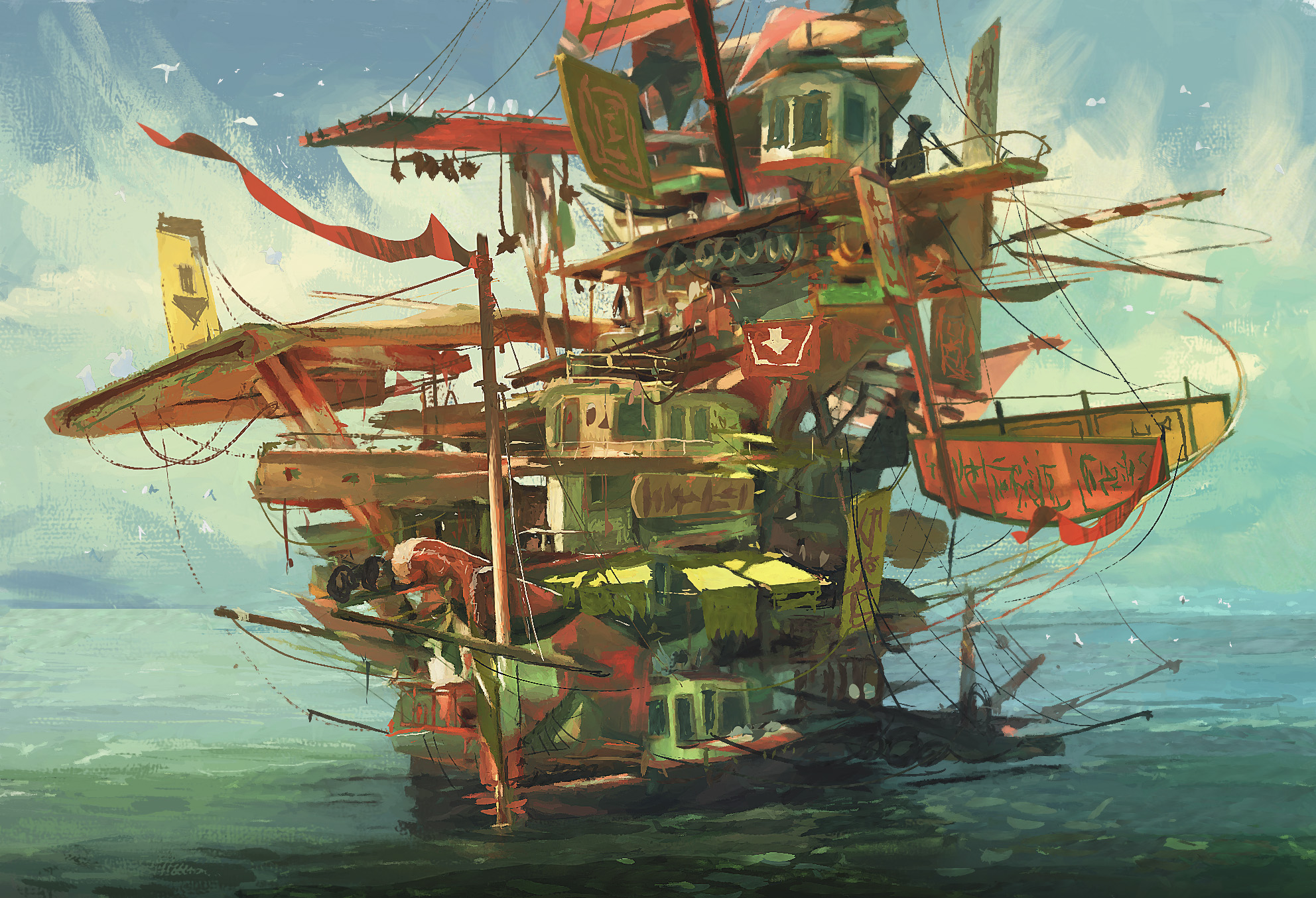
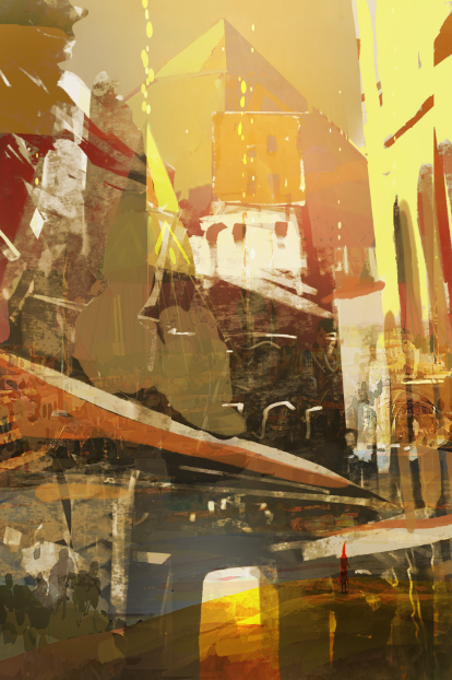
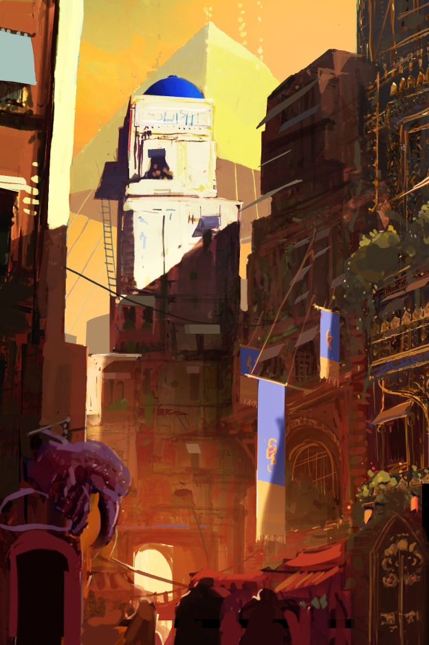
Here you can see an example of how one of the illustrations came to life, in this case, a city illustration, which tended to be more complex than the regular location cards.
I rarely started with a completely blank canvas. More often, I used photobashing or borrowed elements from existing location cards to quickly get something down. From there, I would shape the composition and refine the forms.
To ensure that all the locations felt connected and part of the same world, I reused similar colors, shapes, rocks, trees, clouds, and brushwork throughout. City illustrations were a bit different: about a dozen cities needed to feel unique, but still clearly belong to their specific region. On top of that, each city illustration had to include around five interactive elements for the player, things like a shop, a balcony, a door, a staircase, and so on.
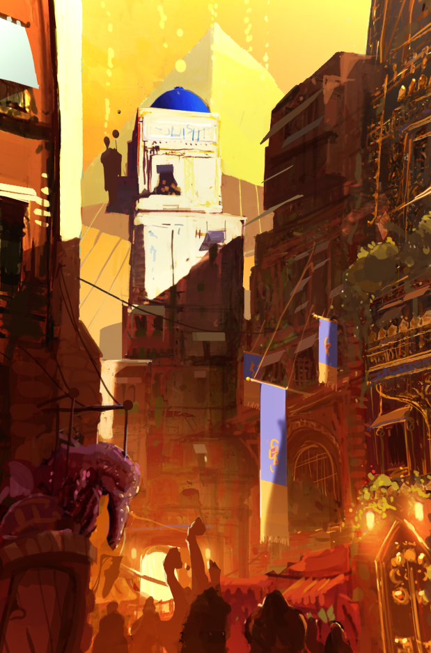
At the top, you can see a final city illustration. On the right, there’s a glimpse of the other city illustrations in a very, very early stage. From there, it was a process of bashing, finding shapes, locking in the composition, tweaking colors, adding a few details, and done.
Honestly, I’d love to go back and spend five extra days polishing many of these illustrations. But there simply wasn’t the time, and the budget per card was limited.
In the end, I believe this rough, fast style actually works. It leaves more room for interpretation, gives the viewer something to engage with, and stands in contrast to the hyper-polished, 3D-rendered or AI-generated imagery we see so often today.
If you’ve made it this far, all that’s left for me to say is thank you for reading. I hope you found it helpful and insightful. If you have any questions, feel free to reach out. I’m happy to help!
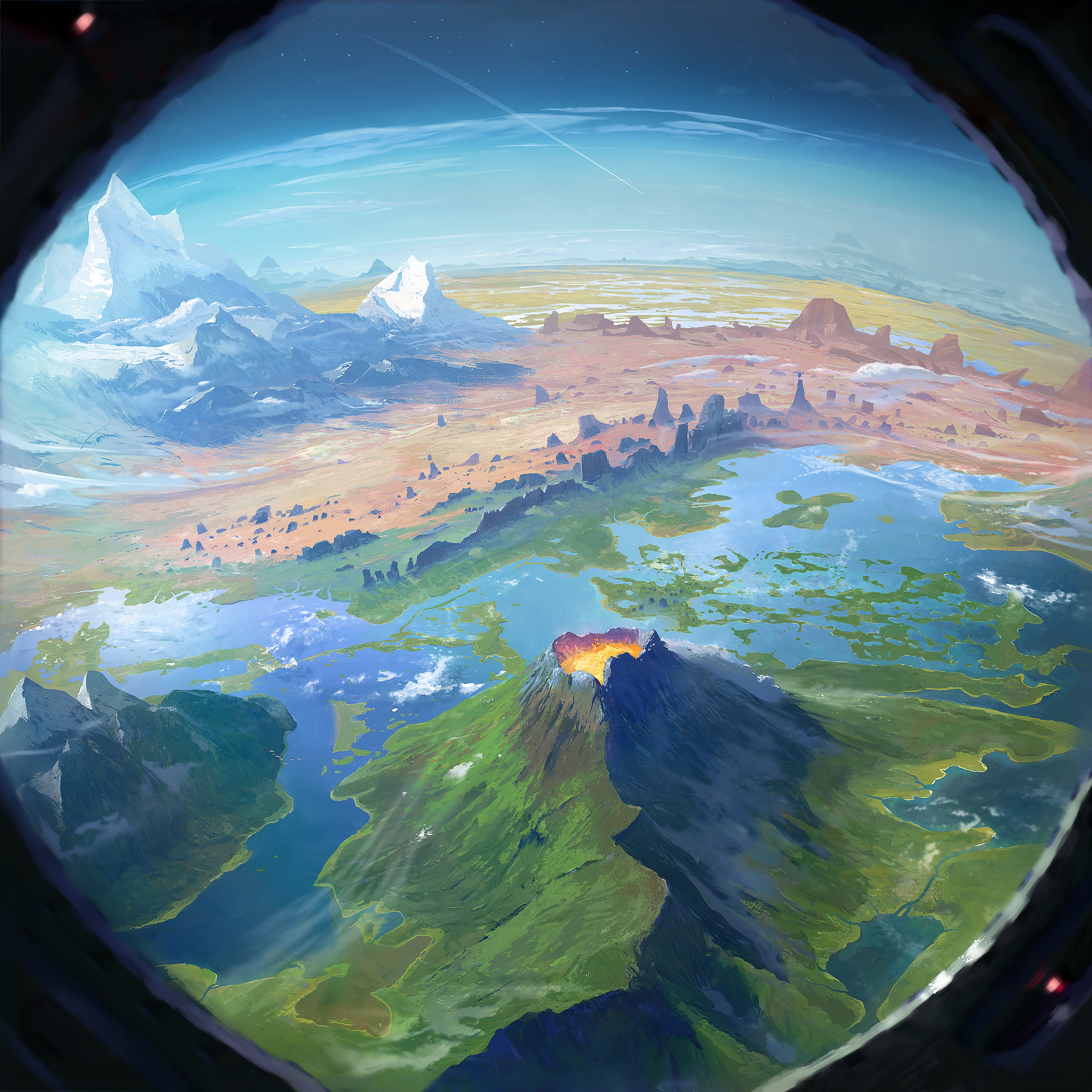
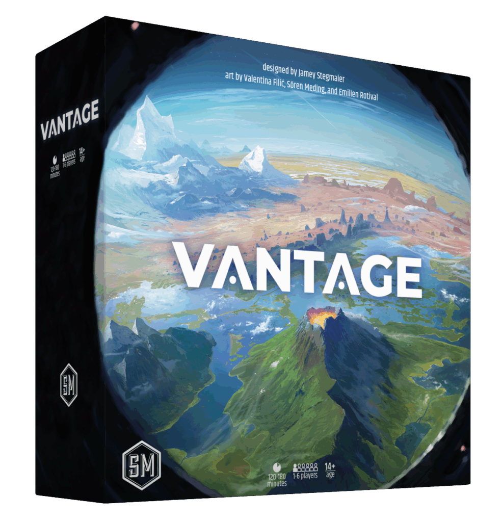
Ah! Almost forgot: here is the box art:
